Review: Sennelier French Watercolors Aqua-Mini Set

sennelier.jpg

(Originally posted 4/7/15)

Little watercolor metal pan sets with good quality paint are one of my greatest weaknesses, and it seems as though manufacturers get more and more clever at popping them out.

Relatively recently, Sennelier came out with a new formulation for their watercolor paints to have a honey base, similar to the M. Graham paints I love so much. I’ve never used Sennelier’s previous formula, but hardly anyone seemed to rave about them so I didn’t pay them much mind. I bought this cute little tin for my birthday last year to see if it was anything worth fussing over.

And what nice paints! They’re very eager to please and reactivate. With even the slightest dab of my brush, the paint explodes into juicy, crystal clear washes. I feel silly saying this, but these paints weirdly seemed so French and romantic to me. Like I couldn’t get the image of 19th century France with someone along the Seine. Honey must do a big thing in watercolor formulas since the extra richness is definitely noticeable. Strangely, I’ve also noticed that they seem to have more of a tendency towards back runs and textures though M. Graham’s honey formulation smoothens out the washes to avoid this.

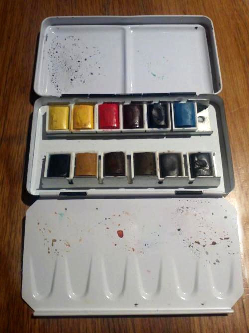
In a gesture I most appreciate, the paints included are listed in the back with the swatch, pigment information, opacity level, and the lightfastness. Very handy, saves me a spot time. The free brush is too small to really be of any use to me, so I’ve never used it. I’d rather use a waterbrush anyway when I’m on the go.

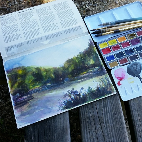
I surprisingly don’t mind the palette. I usually don’t care for having pigments selected for me, but I found the choices very sensibly made. For quick sketching you really don’t need very much to get your point across, and I haven’t yet found myself too limited by it.

I like nontoxic, lightfast, and transparent colors when I’m sketching, and for the most part I didn’t find any color particularly unnecessary. Except for the Pthalo Green Light. I don’t mind it too much, but perhaps a Yellow Ochre would’ve been a better option for landscapes. I also found myself longing for a rose paint with a cold bias. Maybe a nice Quinacridone.

The Payne’s Gray is especially beautiful. A great mixer, it makes wonderful deep silvery greens with the Sap Green provided. It was so lovely I felt drawn to make more monochromatic studies simply to watch the color spread over the paper.

I must say, from a design standpoint I’ve been very impressed with their marketing and packaging. Packaging for me is a pretty big deal, since I personally believe a lack of care in design is usually a good indicator of a potentially poor product. The set itself is very cute and small enough to fit in my pencil case for quick sketches or self induced art therapy.

Anyway, these are great paints and judging from my experiences with this tiny set I might even consider getting some of those excellently priced tubes in the future.

Review: Schmincke Horadam Watercolors

schmincke.jpg

(Originally posted 6/24/14)

If this blog continues long enough, you’ll probably hear me complain over and over again on how America has very few suppliers for pans. After reading Bruce McAvoy’s Schmincke review on Handprint.com, I was very skeptical on trying these watercolors. I had another (admittedly very petty) reason for avoiding them as well- Schmincke insists on stamping its logo on the inside of one of the palette wells, and I was mildly offended that they would take up such precious limited mixing space just so you could be reminded on what brand you were using.

But I couldn’t shake my curiosity on these pans since several artists I admire use Schmincke, and I read some of the most glowing reviews. While browsing in Korea, I finally found the set of 12 whole pans for relatively cheap, so I finally decided to give them a shot.

I’m very glad I did. They were very rich and quite controllable. The paints felt very creamy on my brush and slid onto the paper as easily as anything. The best way for me to describe them are like buttery little candies. I ended getting a 36 pan set later on and then switching the boxes so that the half pans went into the smaller palette while the whole pans went into the larger one. I also purchased colors I liked open stock online.

Paints aside, the metal folding palette it comes in is wonderfully made. It’s very sturdy, strong, and has a nice matte finish. There’s a ring for your finger underneath, and the tray holding the pans can also be removed for even more mixing areas. The tray is also snug enough inside the box that should your box flip over, the pans won’t come clattering out. Schmincke also provided you with a handy color testing chart that includes the pigments and the lightfastness.

Extra pans don’t fit down the middle, but I generally prefer to store a brush or a pencil in there anyway. The box does stain noticeably though I don’t mind too much. I was also curious to see if I could fit an extra full pan in the sliding metal space. It’s possible! I can fit 14 full pans overall in the 12 pan palette once I replace all the colors I dislike.

Which brings me to my con… I don’t like half the pigments included in the 12 pan set. Granted, this is likely to happen with any pre-packaged set you’ll buy, and I don’t blame Schmincke for picking out the colors that it did. The colors they selected are normally recommended for most starter palettes. I usually like only a few of the colors provided in paint sets, so if I could do everything over again, I would just buy all my paints open stock. I personally would rather pay more money for pigments I love rather than have a bunch of pigments I barely use. In this case I was just too anxious to try real pans and I did find them for pretty cheap.

To start with what I don’t like about the colors, I generally don’t like opaque or toxic pigments. Therefore the cadmium paints included in this set see very little use from me. I also don’t usually like a pre-mixed green paint since I like to mix my own for color harmony. If I’m using a green, it’s probably Phthalo green, and that’s rarely used outside of mixing blacks. Other greens might come in handy whenever I want to quickly mute a red.

Prussian Blue is okay…but I usually like Phthalo Blue when I want a green biased blue. Yellow Ochre doesn’t see much use from me either except when I want a quick skin tone while sketching on location. English red is too opaque and overpowering in my mixtures to be of any real use to me. Sepia is okay for darks, but I would normally choose a Burnt Sienna or a Burnt Umber.

I do prefer Sepia over Ivory Black for monochromatic studies though. It does have black in it, but it’s a bit more interesting for me to look at. That being said, Schmincke is an excellent watercolor paint, and it’s lovely to use. The box is handy enough that I can forgive Schmincke for stamping their logo inside. But I really do recommend trying to buy the pans open stock even if that option is more expensive.

Review: Winsor & Newton Artists’ Watercolor Lightweight 12 Half Pan Set

winsornewtonlightweight.jpg

(Originally posted 6/6/13)

I haven’t been a gigantic fan of Winsor & Newton for much of my artistic journey, so I was surprised to actually enjoy using this. The main draw for me was the little tin that I could carry around more easily than the larger palettes. I’ve seen pictures of the heavyweight version of this set, and this tin’s design looks a fair bit handier. The tin does have a slightly flimsy feel, but I don’t mind so much. There’s a thumb ring in the back as well. I don’t know if anyone else does this, but I much prefer either keeping it on my lap or on a table. You can also fit other Winsor & Newton half pans down the middle, but the Schmincke pans are too large.

The colors are quite saturated, and they flow super well. From all the paint sets I’ve experienced, I’ve never been more pleased with the pigment selection. This is mostly because there are no Cadmium paints here. The colors included are:

-Winsor Lemon
-Winsor Yellow
-Winsor Red
-Permanent Alizarin Crimson
-Ultramarine Blue
-Cerulean Blue
-Winsor Green (Blue Shade)
-Yellow Ochre
-Burnt Sienna
-Raw Umber
-Burnt Umber
-Ivory Black

The colors are very transparent, and I think that they were sensibly selected. There’s a nice cold and warm version of all the primary colors for a more interesting time color mixing. I find Winsor Red a nice transparent replacement for Cadmium Red, and I’m very fond of Winsor & Newton’s Cerulean, Burnt Umber, and Burnt Sienna. Cerulean in this brand has a nice grayed down quality that I enjoy along with it’s texture in washes. The Burnt Umber along with the Burnt Sienna glow a lot, and it’s fun to see the patterns they make when mixed with the Ultramarine. I can also mix my favorite darks with Permanent Alizarin Crimson and Winsor Green, or Burnt Umber and Ultramarine Blue with a bit of the Crimson.

If I had to pick one, I think my biggest quip would be that the paints are not hand poured into the pans. I think they’re broken into little cubes that sort of fit inside the pan molds, so the paint falls out pretty easily. But you can just spray water in the pan, let it dry, and all shall be well until it falls out again.

Even though I prefer my Schmincke pans at the end of the day, I do keep coming back to this set simply for the color selection and the tinier palette. It’s been a joy to use with a water brush, and many of my current sketches have been done with this.